"C" is for Colour [Palettes & Hex codes]
Colour is an essential ingredient in designing slides. It can make an image stand out or pop. Clever use of colour can help add to the theme of your presentation which gives the advantage of making the presentation appear more professional and coherent.
Although there is much to discuss about colour, this post is going to focus on building a colour palette in your slide deck. A colour palette is a group of colours which you choose to feature in your design, as if you were an artist dabbling with paints on your tray. Just like in home decor - many of the times, people prefer to use a few select colours or groups of shades complement one another with a few accents or feature colours. By limiting the number of colours present, you can add simplicity and elegance in your design.
[Side note: At this point in typing, I can hear you protesting "I'm not trying to be Monet, and I don't have time to figure out colour palettes in my design...all I want to do is get my slides sorted!" or perhaps "I'm not artistic enough to know what colours to use". To the first argument, I rebut that finding a colour palette is easier than we might imagine and there are numerous websites and tools to help you with it. To the second argument, I return that "being artistic" is not simply a gift - that creativity is a skill which can be learned and built and practiced. Don't put yourself in the "hopeless" basket - I don't believe such a basket exists!]
So with that said, here are my three favourite websites for helping to create colour theming and combinations to use in your slides.
1. Canva Colour Palette Generator
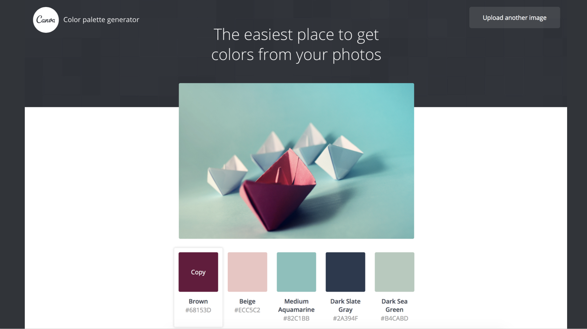
A nice way to help create a sense of uniformity is by making the text of your slides in the same colour as the background image. The canvas generator is useful as you can upload a photograph, and the site spits out colour samples from the image along with a 6 letter colour code (known as a Hex code - see the end of the post for a segue on colour coding) which can be used in powerpoint and web design to match and reproduce the same colour. If you look at the heading picture of this post, you can see that I have used the same colour as the dark pink/red ship for the font.
2. Coolors.co Generator
This generator makes finding a colour palette into something of a game. You simply press the space bar and it will give you a random selection of colour combinations. If you hover over one particular colour you like and click the "lock" button, and keep pressing space bar, the site will spit out other new colours to go alongside the colour you've already selected. Just like the previous site, it gives you a hex code so you can use the colours in your slides!
3. Adobe Colour Picker
For the more OCD of you out there - this Adobe generator allows you to minutely adjust your colour choices. The little spots can be spun around for complementary or opposing colour choices. You can adjust the darkness, brightness and the site gives you both RGB and Hex colour codes.
How do you pick our colours using PowerPoint?
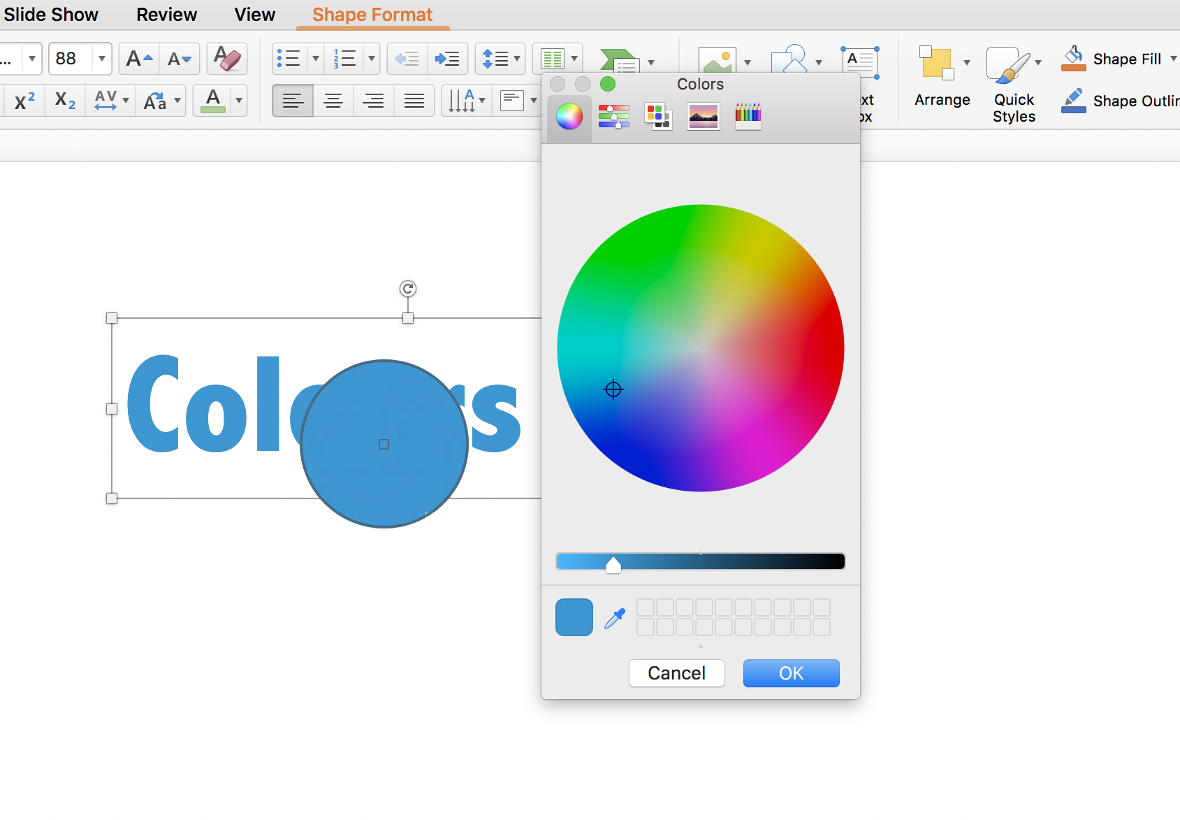
Click on the little arrow next to the colour bar for font (or for shapes), then click 'More Colours'
The colour wheel will come up. You can hit the ink dropper symbol in the bottom left of the colour box and then hover over any colour on your screen (note even outside of powerpoint) to pick out what colour it is.
How do you use a Hex code in PowerPoint?
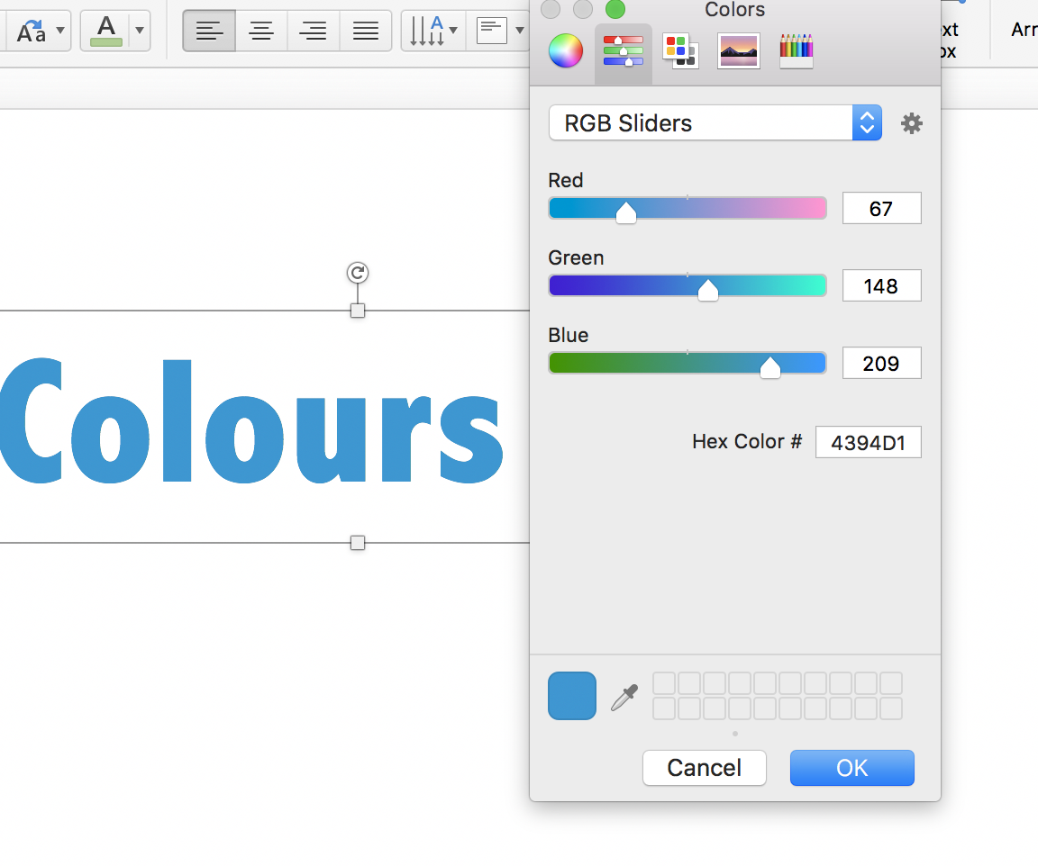
Once you have the colour panel up (after clicking "More Colours" Then click the second icon of the Colour box (the picture with the sliders next to the little wheel in the top left corner). This will give you the RGB sliders and Hex colour options. Simply enter your Hex code in the box and you will get your colour! Hit okay to change your text of fill image to the colour you've selected.
For the curious: What is HEX/how does it work?
All digital colour (on computer screens etc) has to be in a language that computers can understand and a way that it is reproducible for interpretation by human eyes. The colours we see on a computer monitor is a combination of red, green and blue light. This forms the basis of the RGB colour coding system. In RGB there are three numbers corresponding to the brightness of either red, green and blue light. The numbers range from 0-255 with 255 being the brightest and 0 the darkest and the colour produced is the combination of the three. So for examplee RGB 255, 0, 0 is red, RGB 0, 0, 255 is blue and RGB 0, 0, 0 is black.
So what does this have to do with HEX? Hex stands for Hexidecimal. The Hex colour codes are made up of 3 groups of 2 digits preceded by a #.It is based on the RGB codes. The first two letters of the hex code corresponding to Red, the next to Green and the last two to Blue. The range of Hex combos go from 00 to FF (For example #00000 is the colour black and #FFFFF is white). You can find a super nerdy conversion table here but in reality, powerpoint and other websites convert for you like this one.
Here is an example of colour palette use in slides
You've seen these three pictures in the last few posts. Here I have used the pale green, pink/red and white as key colours.
!["C" is for Colour [Palettes & Hex codes]](https://images.squarespace-cdn.com/content/v1/596c4ee73e00beb869b67d1a/1501502494114-19XXAUY1TEJIIFVZKQUM/Screen+Shot+2017-07-17+at+6.15.07+pm.png)


!["D" is for Detail [Great Pictures]](https://images.squarespace-cdn.com/content/v1/596c4ee73e00beb869b67d1a/1504257659668-3EQK7TI3RSSR9VRQ1PF1/detail_lowres3.jpg)
