"B" is for Bold
In both presentations and slide design, it is worthwhile being bold once in a while. This can be found in your style of speaking through the use grand gestures and change of volume or pitch. It can also be utilised as a design tool such as through typography and sizing.
1. Bold typography
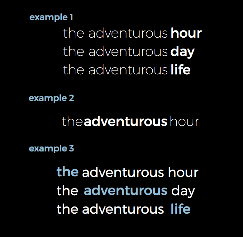
You can help emphasise key words in a quote or figure through the use of bolding text.
In example 1, bolding is used to emphasise the repeated theme. In example 2, bolding is used to eliminate the need for spaces between words In example 3 bolding and colour is used to highlight and unite the key message of "the adventurous life".
2. Bigger is Bolder
You might also try being bold with sizing in your slide design. Don't be afraid of maximising the space you have or even increasing your picture or font size until your text or image spans the entire screen. Here is an example:
Be Bold v1: This slide has a good picture but it doesn't utilise the maximal screen 'real-estate'. The font is clear but it competes a bit with the graphic.
Be Bold v2 : In this improved example, I've gone bigger and bolder with the text and image. I've also used the direction of the child looking to help integrate the text and picture together better. By 'being bold' with image and text - you are helping create for your audience a "wide screen" feel to your presentation.
So next time you're designing a slide or graphic, why not BE BOLD?
---
This is part of a 26-part series I'm doing on an "Alphabetical Adventure in Slide Design".


!["C" is for Colour [Palettes & Hex codes]](https://images.squarespace-cdn.com/content/v1/596c4ee73e00beb869b67d1a/1501502494114-19XXAUY1TEJIIFVZKQUM/Screen+Shot+2017-07-17+at+6.15.07+pm.png)
![Powerful Presentation [smaccGOLD]](https://images.squarespace-cdn.com/content/v1/596c4ee73e00beb869b67d1a/1533218573607-30A3JYRNVAOR99SWGEDH/daniel-cheung-129841.jpg)